Data Analysis
The data analysis tool provides summary of data properties and visual inspection of data points. The data analysis tool is available for the data matrix.
Summary
A summary of data set properties is found in the summary panel, see Figure 1.
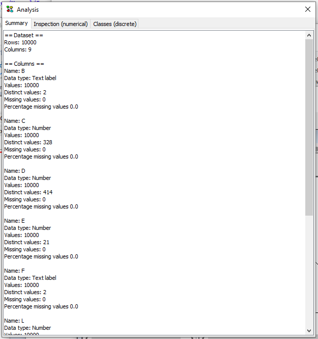
Figure 1: Summary of data set properties
The generated summary reports:
Number of rows in data set
Number of columns in data set
As well as a per column summary that contain:
Column name
Inferred data type - this is either Interval, Number or Text label
Values count (not counting missing values)
Distinct values count
Missing values count
The percentage of missing values (missing/total)
Inspection
The inspection panel provide visual inspection of numerical data points by plotting all values from selected columns in a single chart. Depending on the data type of the selected columns, the chart may take the form of a set of dots (numerical data X numerical data), lines (numerical data X discrete data) or a grid (discrete data X discrete data).
Multiple variables can be selected on the Y-axis by selecting multiple checkboxes in the bottom right panel. The colors of each variable can be customized by clicking on the colored icon next to the variable name.
To plot a set of variables as a sequence, select the special value “Row Id” as the variable on the X-axis. It appears as the first option in the drop-down menu.
The legend in the top-right corner can be removed by de-selecting the ‘include legend’ option at the bottom of the screen.
Note that you can re-size the window to adjust the size of the plot.
The inspection panel in Figure 2 has a plot generated from numerical data.
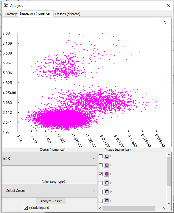
Figure 2: Inspecting plot of numerical data points - missing data is plottet outside chart
A total of three columns can be used to generate the chart: X-axis, Y-axis and coloring. Columns can be selected from the three drop-down lists. The drop-down lists contain column names, prefixed according to data type with either (n) for numerical data, (i) for interval, or (t) for text labels.
Missing data go outside the chart following these rules:
Missing on both X and Y go in the upper right corner
Missing on X and observed on Y go outside chart to the right
Observed on X and missing on Y go outside chart in the top
If a column has been chosen for coloring the plot, values are mapped to colors in the range from red to green, blue indicates missing value.
Classes
The classes panel provides inspection of discrete variables by classifying a variable using a selected target class. When selecting a variable and target class, a table with counts and a column diagram is produced. When a column in the diagram is clicked, the entry in the table that corresponds to the clicked column part is highlighted. Hovering the mouse cursor over the diagram reports the corresponding configuration as well.
The classes panel in Figure 3 contains a diagram for classification using two discrete variables with three states each.
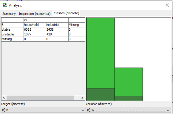
Figure 3: Inspecting classification using discrete variables